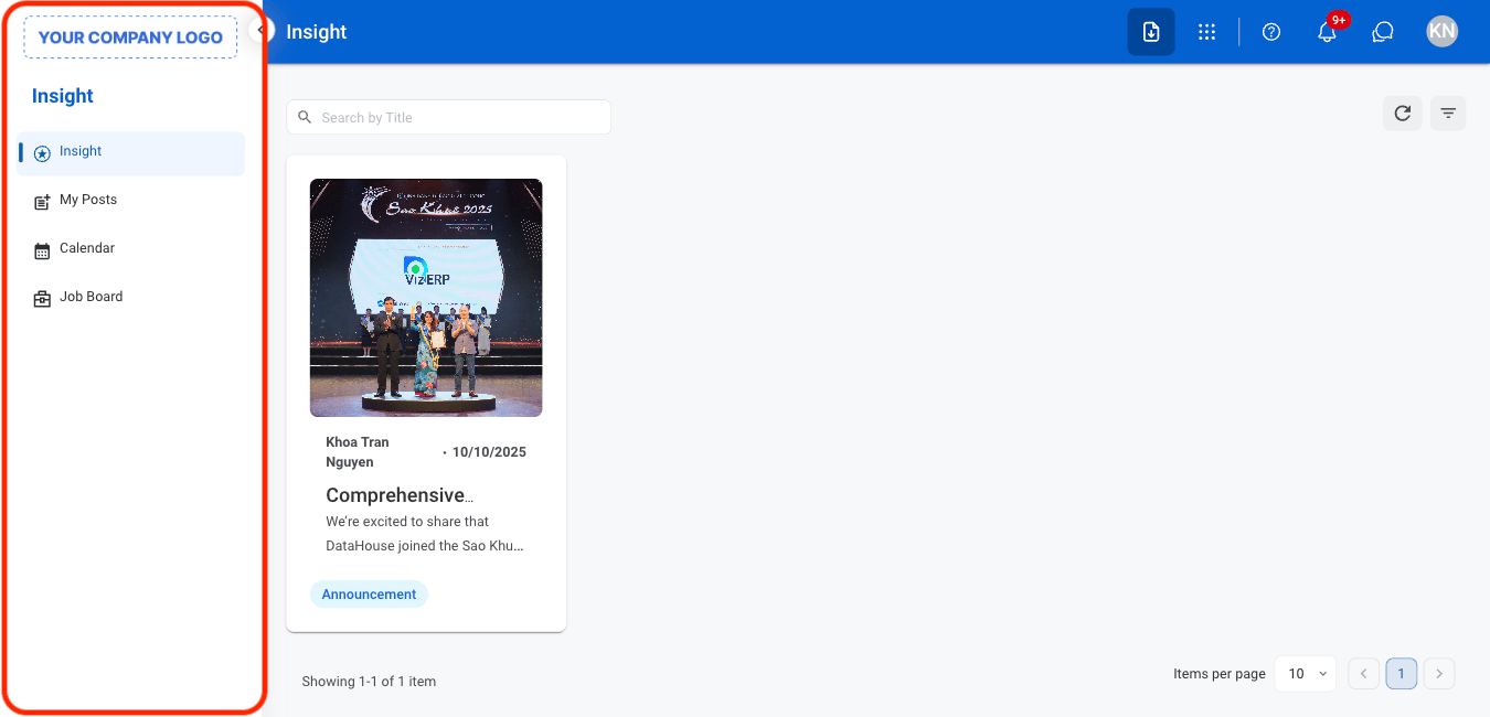
Screen Layout & Navigation
Header
Located at the top page, includes the company logo, title of the current page, and various user-related icons.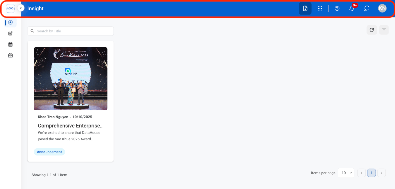
- Module menu: Displayed as a dotted grid, select to access various modules within the system, enhancing workflow efficiency.
- Help & Support: Displayed as a question mark, select to access to system support and resources such as guides, FAQs, or troubleshooting tools.
- Notification: Displayed as a bell symbol, alerts users to important updates or reminders such as system activities, pending tasks, or messages.
- Chat: Displayed as a speech bubble, enables real-time communication with other users or support teams. Select to ask questions, exchange information, or collaborate within the system.
- Profile: Displayed as user’s initials in the top right corner, provides access to personal settings and account management. Select to customize preferences, log out, or view and manage profile details.
Module Menu
Provides access to application modules for managing tasks and business processes such as recruitment, timekeeping, and payroll.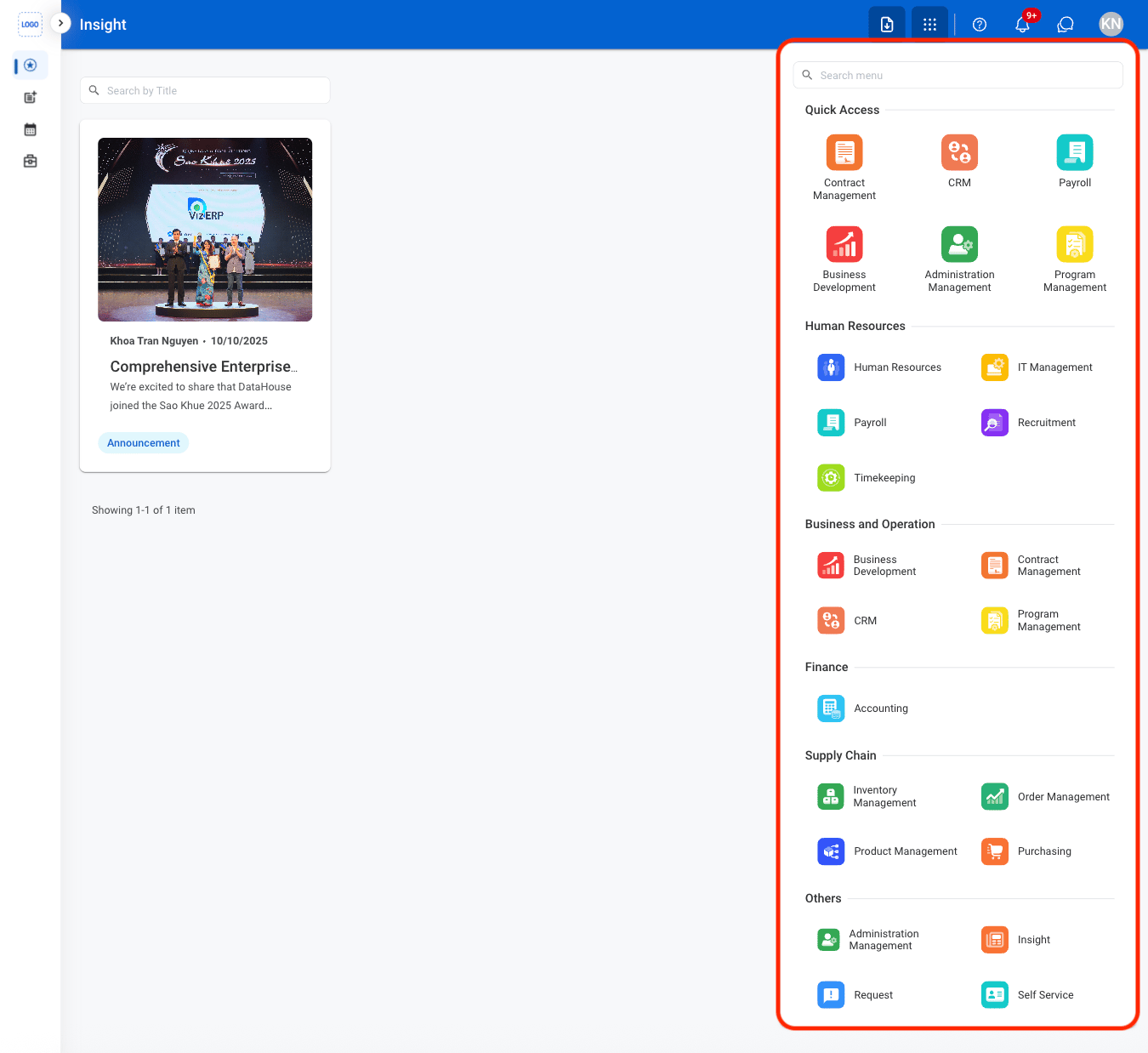
Main Content Area
Displays the primary content for the selected module section, such as dashboards, records, and tasks.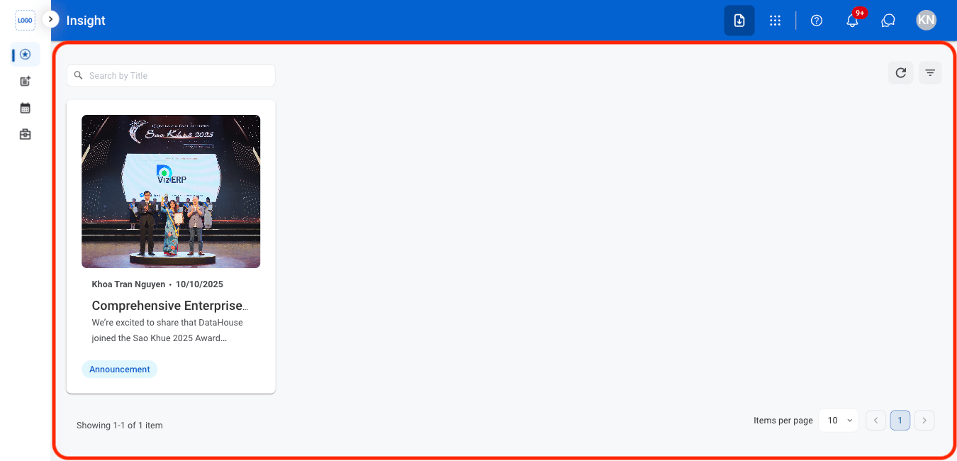
Navigation Panel
Located on the left sidebar, used to navigate between sections within a module.